

Customize ShareLink appearance with view modifiers
While we can provide a fully custom view as a label of the ShareLink in SwiftUI, we can also customize the default appearance with view modifiers instead.
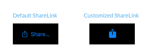
The default style of the ShareLink adapts to its context, but changing its appearance can be useful when we are designing a custom toolbar, for example.
All the style changes that we can apply to a regular SwiftUI Label view can be applied to the ShareLink as well. We can set the label style to only show the icon or the text, adjust the image scale or choose a symbol variant.
ShareLink(item: url)
    .labelStyle(.iconOnly)
    .imageScale(.large)
    .symbolVariant(.fill)
Since all of these values are set in the environment, SwiftUI will read them internally and apply to the label of the ShareLink for us.
Here is how the default appearance of the link gets updated with our modifications.

Check out our new book!
Swift Gems
100+ tips to take your Swift code to the next level
Swift Gems
100+ tips to take your Swift code to the next level
- Advanced Swift techniques for experienced developers bypassing basic tutorials
- Curated, actionable tips ready for immediate integration into any Swift project
- Strategies to improve code quality, structure, and performance across all platforms
- Practical Swift insights from years of development, applicable from iOS to server-side Swift