

Align y-axis to leading edge in Swift Charts
The default behaviour in Swift Charts appears to always draw the y-axis in the trailing edge of the chart. However, in many cases I would prefer my charts to render with this y-axis on the leading edge.
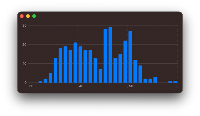
I have found that I can controle the position of the y-axis ticks using chartYAxis() modifier in combination with AxisMarks(position: .leading).
struct SimpleChart: View {
    var body: some View {
        Chart { ... }
        .chartYAxis {
            AxisMarks(position: .leading)
        }
    }
}
Swift Charts are designed to work with SwiftUI, but you can still use them in a UIKit project. You can check out Natalia Panferova's recent book Integrating SwiftUI into UIKit Apps for ways to add SwiftUI views to an existing UIKit project to take full advantage of the new iOS 16 APIs.


Check out our new book!
Swift Gems
100+ tips to take your Swift code to the next level
Swift Gems
100+ tips to take your Swift code to the next level
- Advanced Swift techniques for experienced developers bypassing basic tutorials
- Curated, actionable tips ready for immediate integration into any Swift project
- Strategies to improve code quality, structure, and performance across all platforms
- Practical Swift insights from years of development, applicable from iOS to server-side Swift